Learn How Apple Integrates Shneiderman’s 8 Golden Rules

1. Consistency
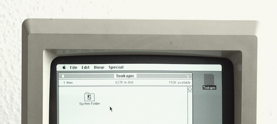
“Consistency” and “Perceived Stability” are woven into the design of Apple’s Mac OS. The Mac OS Menu Bar is designed to contain consistent graphic elements regardless of whether it’s a version from the 1980’s or the 2010’s.


2. Shortcuts
As mentioned previously, Mac allows users to use a variety of keyboard shortcuts, commonly used examples include copy and paste (Command-C and Command-V), and taking screenshots (Command-Shift-3).

3. Informative Feedback
A great example of visual feedback can be seen when a file becomes “highlighted” as the user clicks on a file on a Mac desktop. Another example is when the user drags a folder across the desktop, they can see the folder represented as physically being moved as they hold down their mouse.

The ‘Learning’ folder becomes highlighted as the user clicks on a folder on a Mac desktop.

The folder is represented as physically being moved as the user holds down the mouse and drags a folder across the desktop.
4. Dialogue
As the user installs software to the Mac OS, an informative screen shows what step the user is currently at in their installation.

5. Error handling
During software installation, users are gently alerted with an informative message if an error was made. It is important to recognize when to use smaller, less intrusive alerts and when to use greater alerts to warn a user depending on the severity of the error at hand. However, it is almost never acceptable to punish the user when errors are made, so be cautious and select the right tone and the right language when drafting an error message that will ultimately be read by your human-users. So don’t simply leave an error-code to “handle” it!

A gentle error message is shown explaining to the user what was happening and why it was happening. It even goes further to reassure the user, telling them that they are in control (see ‘Support Internal Locus of Control’ below) by explaining that this is due to their own security preference choices.

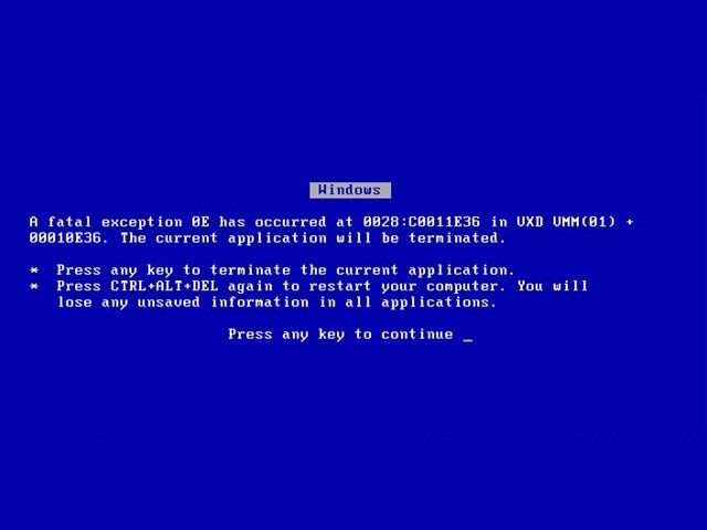
A bad example by Windows displays an error message that uses the words “fatal” and “terminated”. Such negative, unfriendly words are sure to scare away most users!
6. Permit reversal of actions
When users make an error in providing information during the installation process, they are allowed to go back to the previous step instead of being “punished” by having to start over.

The user can undo a previous action quickly and easily.
7. Support internal locus of control
Give users the power to choose whether to continue running the program or exit from it. Mac’s Activity Monitor allows the user to ‘Force Quit’ when a program has unexpectedly crashed.

The user is able to Quit or Force Quit a program if it crashes.
8. Reduce short-term memory load
As humans are only capable of retaining 5 items in our short term memory at one time, the Apple iPhone has stuck with allowing only 4 app icons to sit in the main menu area at the bottom of the screen. This decision does not only involve consideration of memory load but also considers consistency as well.


Great examples of how Apple implements the rules of consistency (1st rule) by displaying the same bottom menu across different versions of the iOS. This is also a great example of how Apple reduces short-term memory load (8th rule). As humans are only capable of retaining 5 items in our short term memory at one time, the Apple iPhone has stuck with allowing only 4 app icons to sit in the main menu area at the bottom of the screen, regardless of whether it’s the iOS 4 or the iOS 7.
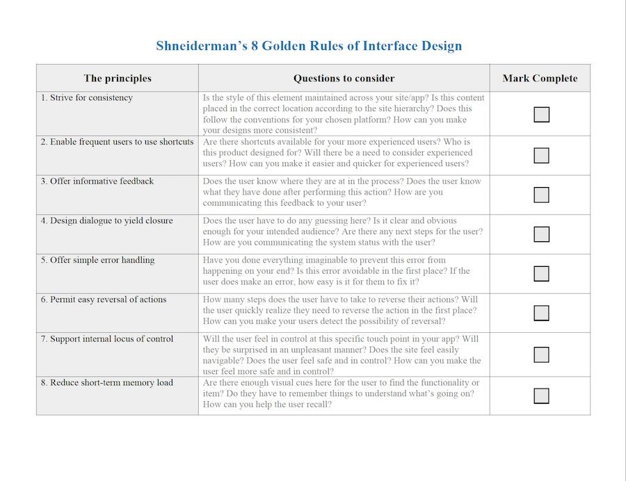
Worksheet: How You Can Apply Shneiderman’s 8 Golden Rules to Your Interface Designs
Your job as a designer is to make your user’s lives easier by creating intuitive, well-designed and frustration-free user interfaces. Applying Shneiderman’s eight golden rules of interface design will help you do just that. Here’s a worksheet for you to work through as you learn to apply these rules to your designs.

