The Golden Ratio in Design

Although traditionally used in art and architecture, the golden ratio can be referenced to design aesthetically pleasing interfaces.
By Kelley Gordon
Proportional systems are based on ratios and have been used for centuries in architecture and art. The golden ratio was first mentioned as early as about 500 BC by Phidias, Plato, and then Euclid. It is fair to assume that this ratio has been discovered several times throughout history — hence its many names, including golden mean, golden ratio, golden section, divine proportion (coined by Leonardo Da Vinci) and the Greek symbol φ.
The exact mathematical definition is as follows (according to Wikipedia):
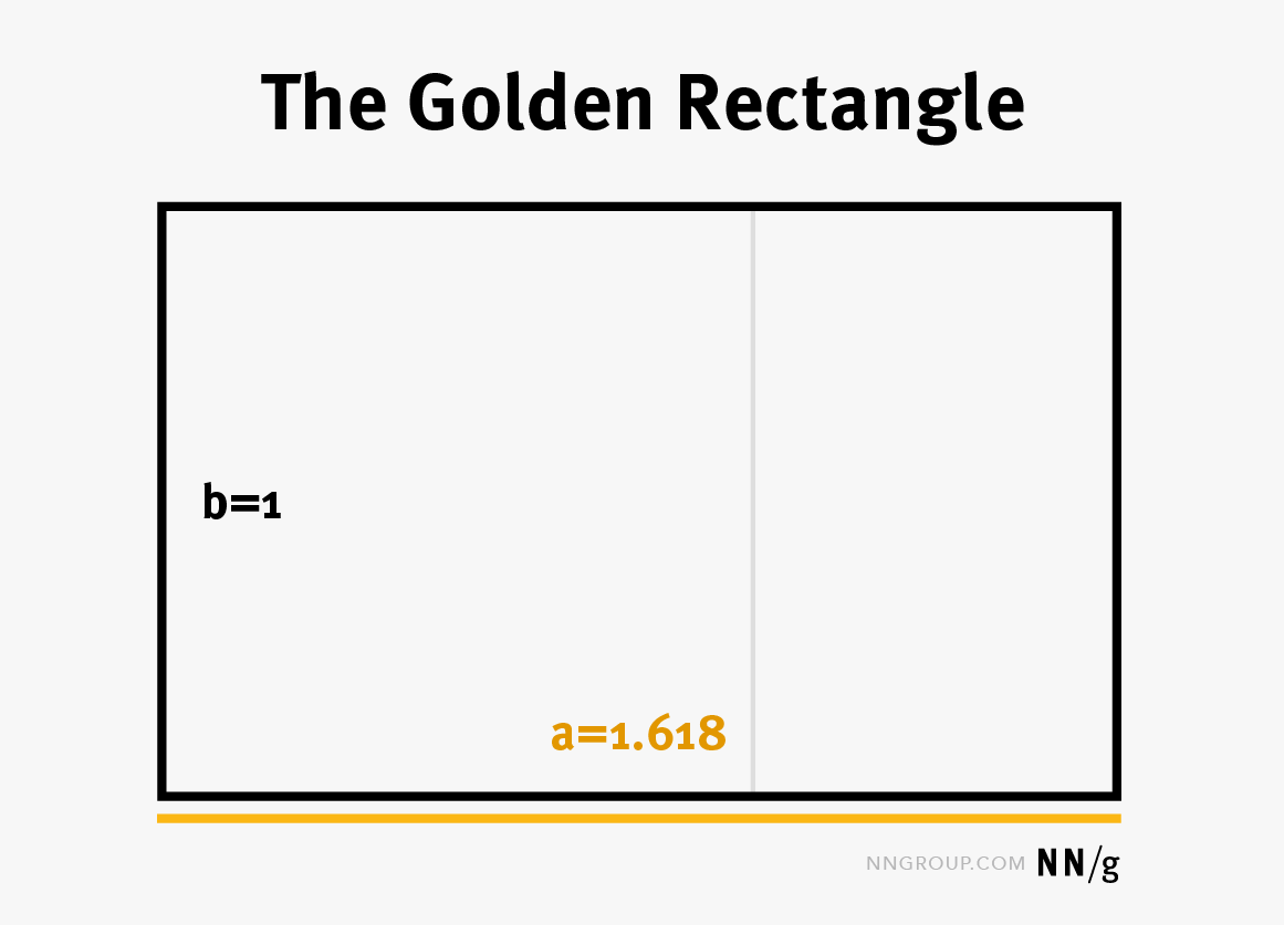
Golden ratio: Two quantities a and b (a>b) are in the golden ratio φ if their ratio is the same as the ratio of their sum to the larger of the two quantities:


The golden ratio φ can be shown to have a special property:

and is equal to 1.618033… (an irrational number). (You can check that 1/0.618=1.618.)
A study by Giacomo Rizzolatti and Cinzia Di Dio suggests that human brains are hard-wired to prefer human bodies with proportions in the golden ratio. In the study, participants with no background in art, were shown an original image and distorted versions of a statue. The original statue’s proportions reflected the golden ratio. The original image strongly activated sets of brain cells that the distorted images did not, suggesting beauty is partly an innate quality.
The golden ratio has been used to analyze quantities found in nature, architecture, painting, and music. When used, it is often assumed to create an organic, balanced, and aesthetically pleasing composition, thought to be favored by the human eye.
Examples of buildings and works of art that have proportions in the golden ratio range from the pyramids in Giza, the Parthenon in Athens, and Da Vinci’s Mona Lisa.

The Golden Rectangle and Spiral
The golden rectangle is simply a rectangle whose sides are in the proportion of the golden ratio.

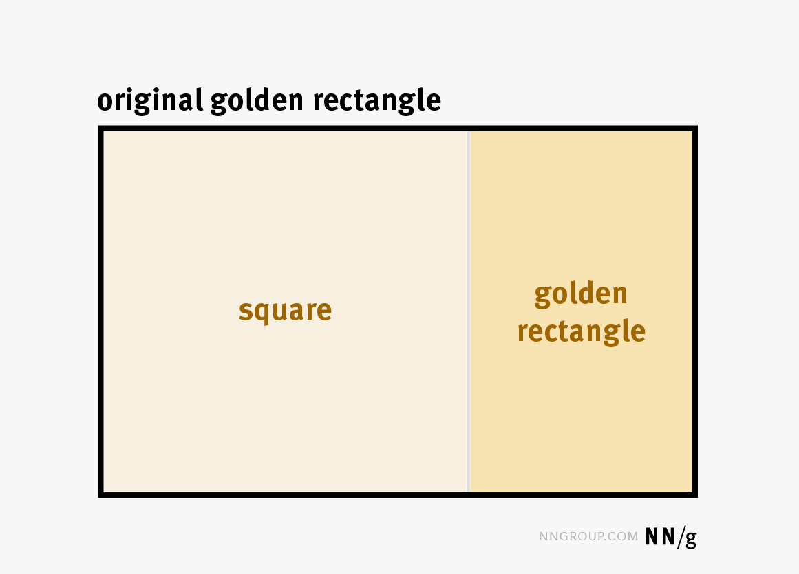
The golden rectangle has an interesting property: if you divide it into a square with the side equal to the rectangle’s shorter dimension and another rectangle (like in the image below), it turns out that the smaller rectangle is a golden rectangle as well. (This property is immediately derived from the golden-ratio property described in the previous section.)

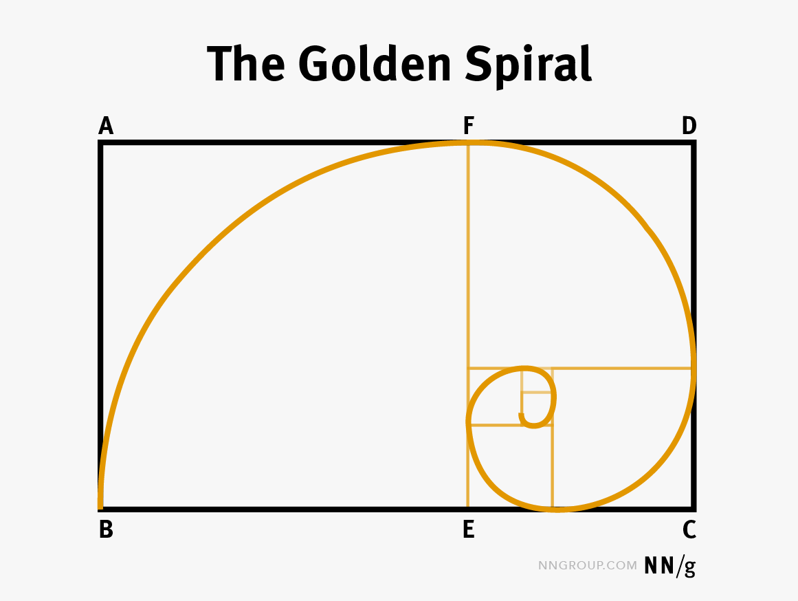
You can repeat the process indefinitely by dividing each golden rectangle into a square and another golden rectangle. The result will be a golden spiral — obtained by connecting the opposite corners of each of the squares.

The golden spiral is found within many naturally occurring elements such as plants and in weather patterns like hurricanes.
Examples of the Golden Ratio in UI Design
How is the golden ratio used in interface designs? Let’s consider a couple of common examples:
Text Sizes
Different font sizes can be in a golden ratio. Let’s say the body-font size on your website is 16px. The header-font size could be a golden-ratio multiple of your body size — that is, it could be 16 φ = 16 x 1.618 = 25.88 or roughly 26px.
Some also use the golden ratio to determine the line height needed for a particular font size to be in a golden ratio. (The line height is the font height plus the white space between lines of text — it basically governs how tightly arranged the lines of text are in a paragraph.) For example, if you had a font size of 16px for your body copy, the line height could be 16 φ = 16 x 1.618 = 25.88 or, again, roughly 26px.


However, it turns out that things are a little more complicated because, as line lengths get longer, line heights must also increase in order to maintain readability. For example, a 2004 study from the University of Reading, concludes that long line lengths need more interlinear spacing so that the eyes can easily locate the next line down. If you really want to design your typography with the golden ratio in mind, you can use a golden-ratio typography calculator, which will give you an ideal line height for a given font size and line width.
Image Cropping
Composition is important when creating compelling imagery. A quick and easy way to crop images and create a strong composition is to apply the golden spiral over the focal point of the image.


Webpage Layout
A 2-column layout is naturally created when you divide a golden rectangle into a square and a smaller golden rectangle. The resulting layout is perfect for a main content area and sidebar. Loosely following this layout creates structure and balance to an interface. However, on today’s responsive websites, it will be hard to fully support the golden ratio across all viewport sizes. If you focus on creating a basic grid based on the ratio and align components to it, you will be able to get the basic benefits of the ratio at least on some screen sizes.


Conclusion
Some designers are fascinated with the golden ratio and use it to create and edit all sorts of interface-design elements. Others believe that the golden ratio is no more valid than any other method used to derive sizes and proportions. Regardless, the golden ratio can be a helpful reference to new visual designers or designers wanting to improve their skills with a concrete, mathematical approach.
