
Trends are well-known changes that happen in all creative fields, and web design is no different. Born of experimentation and innovation, trends are the driving factors for change, which (for the most part) push an industry forward for the better.
The web is a unique environment which is constantly changing and evolving, and with that in mind, we run down what we believe are 10 of the most important trends to be looking towards over the next 12 months.
-
More brands adopt a mobile-first approach
As the name suggests, mobile-first design is the process of designing for mobile (or smallest screened devices) first, then working up to the bigger ones.
The mobile-first approach to design isn’t new to 2016 and has been around for a few years now, but with mobile-phones now officially named as the primary devices used for browsing the web, more companies are realising the importance of having a site that effectively delivers content on a smaller screen, and are rushing to get onboard.
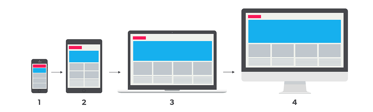
Content is designed to fit on mobile and smaller screened devices first, then you work up towards the larger-screened devices.
Design and visuals aside, the mobile-first model and the restrictions it brings is a useful way for brands to really consider what their core content and message is that they want to communicate.
Smartphones (for the most part) come with significantly smaller screens than tablets and desktops, which limit the amount of content a user can easily view at once. This forces brands to do-away with any information or content which isn’t 100% necessary, allowing them to add it in, along with the additional visual bells and whistles for users as they switch up to larger screened devices.
Our prediction: Mobile-first isn’t a concept new for 2016, but we anticipate seeing more sites over the coming year which take a more thoughtful approach in delivering their content to smaller screens, rather mobile design being a tacked-off after-thought to the desktop build.
-
Wider implementation of responsive design
We know what you’re thinking – first mobile first, and now responsive design? Neither of these are new for 2016!
Although responsive design is also something which has been around for a few years, what we predict to see over the coming year is an even bigger uptake in the number of brands, both big and small, who are building responsive-based sites.
For those who may not know what responsive design is, it’s essentially an approach to building a site using CSS media queries and flexible grids/layouts to create a single, dynamic site which adjusts and re-jigs it’s content to best display itself on various sized devices. It works hand-in-hand with mobile first, as mobile first designs the experience and the look, and responsive implements it.
One of the bonuses of responsive design is that it allows businesses to pay for just a single site build which effectively delivers content on mobile and tablet, all the way to laptops to big-screened desktops.
Cost-effectiveness aside, the reason we anticipate even more brand’s employing this is because of an update to Google’s ranking algorithm which dropped in April last year. To sum it up, Google’s update now boosts the rankings of sites which optimises it’s content (and thus user experience, a la the mobile first principle) to mobile devices and users. Any site which isn’t optimised for mobile is set to see a major shake up in where it ranks online. See more from Google here.
If you’re looking to see whether your site is ‘mobile-friendly’ under Google’s update, be sure to test it with this handy tool.
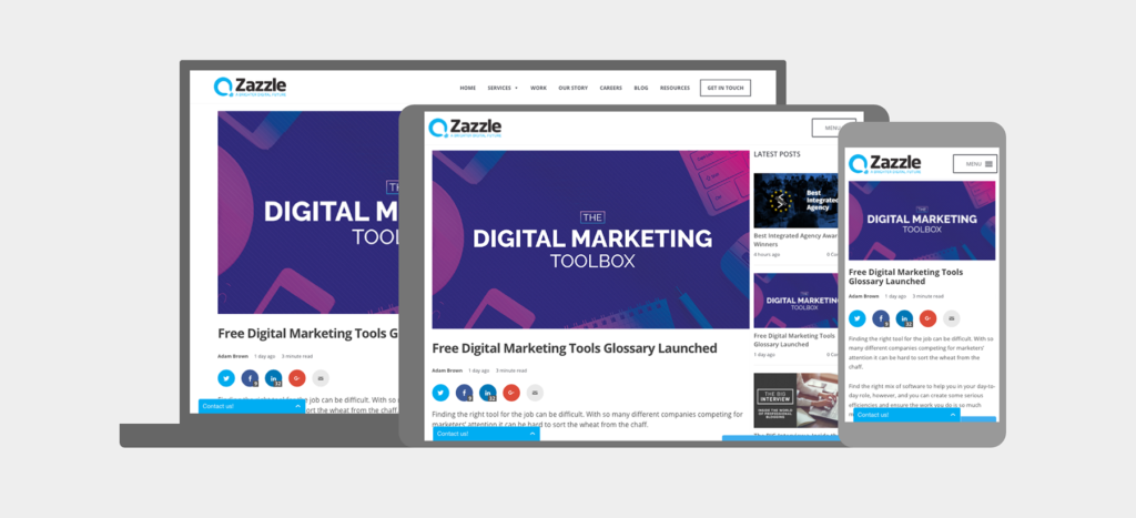
The above example, taken from our very own blog, shows how with a responsive build, content is able to re-jig itself automatically to best display itself on different devices. You can check to see how your own site looks on various devices with Google’s handy Resizer tool, found here.
Rankings aside, what’s also interesting to note is how user behaviour has changed over the last couple of years. Internet users have quickly taken to mobile-optimised sites which make their browsing experience easier, and any site which now doesn’t meet these standards simply won’t cut it. As this infographic from Experience Dynamics shows, 79% of users will leave the site they’re browsing and find another if it isn’t optimised – something for brands to really consider!
Our prediction: Much the same as with mobile first – we predict a larger increase in the number of brands and businesses who implement this approach to ensure that they achieve the rankings in search that they desire, as well as keep those all-important customers happy with the user experience.
- UI Patterns and Framework
The mobile-first and responsive approach to web design, as well as the increasing popularity of WordPress and pre-designed themes, has had a somewhat noticeable impact how many desktop sites work and look today.
What we’re starting to see more and more are both UI and UX patterns emerge across the web where many sites look and function in very similar ways as they learn from one another to hone their user’s experience.
We won’t delve into the argument that all sites are now beginning to look too ‘samey’, but instead look at how these consistent UI and UX patterns are leading the web to become a more consistently user-friendly place to be.
With so much online competition today for brands across all sectors, they can’t afford to take major risks in their user’s journey, and if these tried-and-tested patterns and principles work, it makes sense to use them (where appropriate!) to enhance their site.
A high profile example of this came with Google’s 2014 launch of their Material Design Language – a set of design principles and guides which they developed to create a more consistent user experience.
They summarise the goal of Material Design to ‘develop a single underlying system that allows for a unified experience across platforms and device sizes. Mobile precepts are fundamental, but touch, voice, mouse, and keyboard are all ?rst-class input methods.’
Google have implemented many of these principles within their own apps, and many other brands are adopting them for their own sites in order to enhance the experience for their users.
Our prediction: As these existing UI and UX patterns evolve and develop, we’ll see more and more brand’s implementing them as we move one step closer to a more unified, and consistent online browsing experience.
Keeping users happy with a streamlined UX is the top priority now as brand’s do away with design gimmicks in order to compete in an ever-increasingly more competitive market.
-
Focus on originality and the decline of stock imagery
As discussed above, the rise of UI patterns which now places UX as the most important aspect of design, means that many sites now look and work in similar ways, and brands now need to do away with stock imagery, videos and icons and be completely bespoke in order to stand out from the crowd.
Customers and users today seek authenticity from the brands they use, and stock pictures of creatives sat around a screen, or business men smiling just won’t cut it anymore.
In order for a brand to really strike a connection with it’s audience, they’ll need carefully considered and completely bespoke visuals which are more representative of who they really are.
The following are all examples of how brands will hope to achieve this over the coming year.
Bespoke Illustrations
Illustrations are fantastic, versatile mediums for creating visuals which are playful and friendly and add an element of fun to a site. Talented illustrators are able to create illustrations which are full of personality and tailored to match the tone of the brand, something which brands will be striving for more than an ever in an increasingly crowded marketplace.
With a unique style of illustration established, brands are then able to roll that out through their entire identity, for use in large header images, custom iconography and beautifully animated visuals.
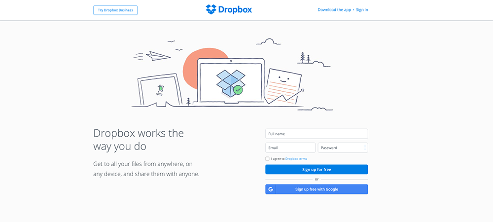
Dropbox (right), is a great example of a brand who uses illustration to create beautiful, friendly and totally unique visuals which are full of character to appeal to their users.
There are trends which are unique to illustration as a discipline within itself. We won’t linger on them too much here, but we recommend checking out Dribbble to see what kinds of illustrations the world’s best are working on. This is usually a good indicator of the styles and trends which will grow in popularity.
Big, bold, beautiful typography
Typography is also a powerful visual medium, able to create personality, evoke emotion and set tone. As device resolutions become sharper and type becomes more easy to read on-screen, brand’s will be looking to push the limits of typography even further to appeal to their users.
Expect to see an increase in over-sized and full screen type which breaks the grid, beautiful, unique, hand-rendered typography and lots of dynamic text and image layering working in tandem with parallax scrolling.
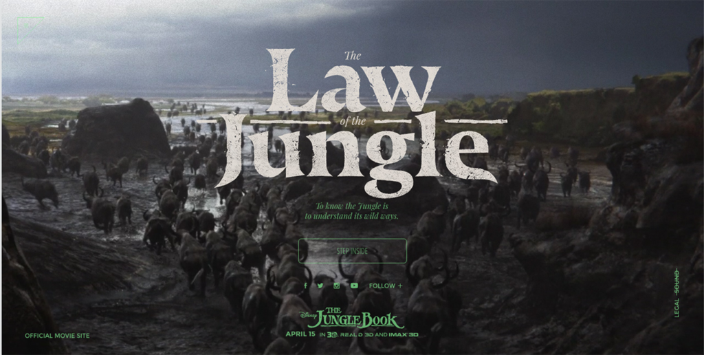
The above screenshot, take from the promotional site for the new Jungle Book movie site is a great example of beautiful typography being used online.
Authentic photography
The big one – photography. Photography will always be a main-stay within web design and design in general, but as mentioned before, people desire authenticity from the brands they use and they know a canned, stock photo when they see one.
Brands and designers will now be thinking more carefully about the imagery they use on site, hiring professional photographers to take their shots which frame them in the way they want to be seen.
Unfortunately, it’ll probably be a long time before much of the cheesy and cringe-inducing stock photography completely disappears, but expect to see it start falling off a little more quickly this year.
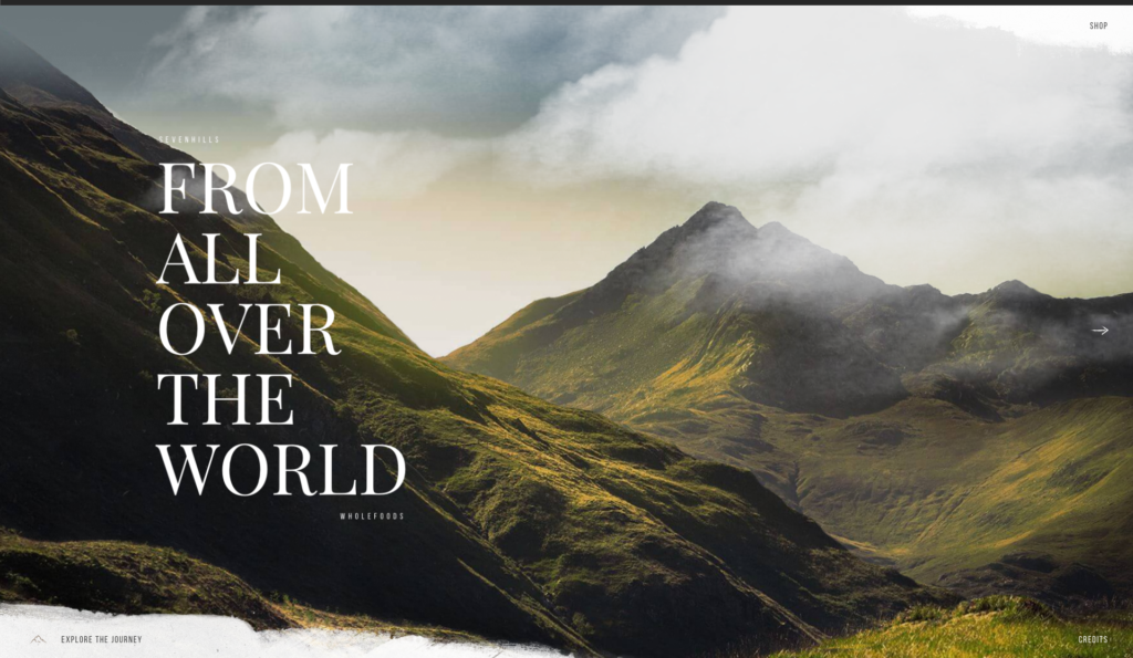
Sevenhills Wholefoods uses beautiful full-screen imagery to draw users in and assist with their brand message and story-telling.
Our prediction: We expect many sites, although increasingly similar in their structure and usability, to become more visually diverse and interesting as more unique creative, branded content is produced.
We anticipate seeing brands finding innovative ways to make their mark, using photography, video, illustration and typography to really build their own aesthetic online. Unique, carefully-considered is the name of the game here!
-
Animations advance
As browsers and languages become more advanced, we’re seeing more websites move away from the use of static imagery and ?nding new ways to engage users and be unique in their approach to communicating.
Story-telling and personality is something more and more brands are working on in hopes to capture their user’s attention, and animation, in part thanks to developments with HTML5, CSS and jQuery, is starting to play a bigger role in this.
Animations, following on from illustration above, come in all different shape, sizes and styles, and can all serve different purposes. Animations can range from tiny loading-devices which entertains the user while waiting for content to load, to an interesting hover-state used as a UX device to show a user they’re hovering over a link.
They can also be used on a much larger scale, as rich, full-screen animations, which can integrated to work with scrolling, navigation or be used as the focal point of the entire site. Animation is another useful mechanic for brand’s to create meaningful micro-interactions between themselves and their users.
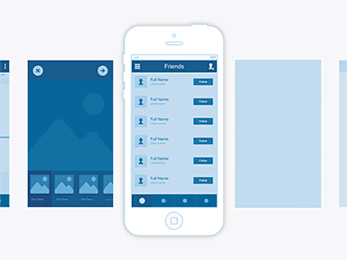
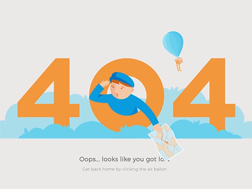
The two examples (right) show how animations are now becoming more central to the design process. One designer uses animations to make UI transitions and changes more dynamic, while another uses subtle movements on an error 404 page for added personality and entertainment.
With all this said, they should only be used sparingly, and carefully, to enhance the user’s experience and not detract from it. No-one wants to wait forever for content to load because of clunky animations holding it up!
This how-to video from Adobe is a great place to start for learning about animation and creating GIFs. It covers the basics of how they’re produced in After Effects and looks at the simple shape, minimal design approach to animation which is becoming increasingly popular.
Our prediction: More and more brands will be looking at their sites and services to see how they can implement animation to enhance their users experience. Expect to see the use of animation increase, from small hover-states and little touches, to full blown visuals for story telling.
-
Video becomes king
They say a picture paints a thousand words, but a video does that tenfold. Much like with animation, a moving image on a page instantly captures the users attention, drawing them in so brands are able to get across their carefully constructed narrative and message.
Video, although by no means new, is long-established and versatile medium, useful for story-telling, marketing and vlogging alike, and has several advantages over traditional photography. Where static imagery is flat and motionless, video is altogether more dynamic, using sound and movement to appeal to the senses and hold attention for longer.
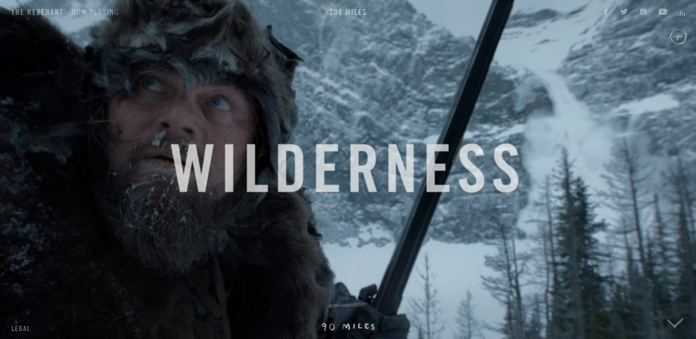
The above screenshot from 200miles.com, a promotional site for the movie The Revenant, uses full screen video and minimal typography to create an engaging experience which instantly draws the viewer in, encouraging them to stay on-page longer and watch the video to see what unfolds.
Video is quickly taking over the internet, and the above reasons are testament to how successful it is as a means for content delivery.
This infographic from Hubspot suggests that by 2018, 79% of all consumer internet traffic will be video and that 50% of all mobile traffic is now already video based. If you’re not convinced that video is the way to go for 2016, you may have to re-think your strategy or face falling behind!
As well as using video for marketing purposes, it’s becoming more widespread in social media, with the recent releases of live-streaming services Periscope, and Meerkat illustrating the demand people have to not only view video content, but produce their own.
Our prediction: Video is already huge, but it’s a trend which is set to continue even more so until it completely dominates the web and all online content.
The benefits of video outlined above are reason enough for brands to want to incorporate it, but what may be more important is the fight to stay relevant or risk falling off the band-wagon, in what are transitional times for digital content.
-
Courageous Colours
2016 is definitely the year for super-rich colours online. Whereas in the past, many brands and designers have typically stuck with web-safe colours, more brands today are being braver in their approach to using colour, as we’re seeing with over-saturation, vibrant hues and a resurgence in the use of gradients. This in part is helped by technological advancements in monitors and devices with screens that are more apt at reproducing richer colours.
The use of bolder colours in web design is helpful in attracting the attention of users, but it’s also a signifier of change for brands, as many make a conscious effort in 2016 to try new things and break new ground, moving away from the previously established, ‘safer-bet’ practises.
A good example of this is with Spotify’s recent update to their branding, moving from their well established, and ‘safer’ green colour, to a more noticeably vivid hue.
Although the actual aesthetic of it was met with mixed reviews, the music streaming brand justified it as a necessary change, as they shift their brand focus and reputation from being a primarily ‘techy’ company, to being a purely music focused brand.
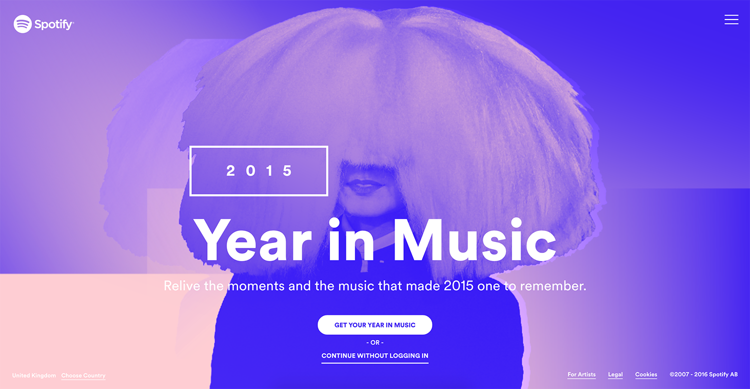
Spotify is really being brave with their colour palette in 2016, as their recent brand update and their above Year In Music interactive site shows Expect to see more brands adopt vivid colour schemes in their online content.
For brand’s who are looking at revamping their colour palettes in 2016, we’d recommend checking out uiGradients, Coolors, and Adobe Color to ensure that your colour choices are bold, engaging, and bang-on trend.
Our prediction – Expect to see more vivid colour palettes online in all creative outputs, from photography, illustration, typography, video and UIs.
We also expect to see brand’s take a braver approach to using colour within their core branding and identity, as existing brand’s re-position themselves and more start-ups launch in hope’s of gaining attention and cutting their own path.
-
More card and grid UIs
We’ve previously touched on the rise of UI patterns, and although there are hundreds of which we could touch on, one which is seeing more and more across the web is the use of card-based UIs, a fundamental principle from Google’s Material Design.
Cards, made famous by Pinterest and then even more so by the likes of Facebook, Twitter, and Google are UIs where pieces of content (text, imagery, video) are broken down into individual ‘cards’ which the user is able to navigate through. Card UIs allow brands to show larger amounts of content on a screen at once, but in more manageable chunks, so users can quick scan to see what’s appealing to them and dismiss what isn’t.
As well as addressing the internet’s need for quickly consuming as much content as possible, card’s tie in nicely with Mobile-First design and Responsive principles, working well on tablet and mobile (think of those precious mobile users!) with gesture based swiping, as per Tinder, Chrome, Safari, which then scale up nicely for desktop users.
Cards also allow brands to build more robust systems for creating and organising content, as users can filter, customise and sort them to suit their own needs, allowing brands to cater to the needs of their users on a much more personal level.
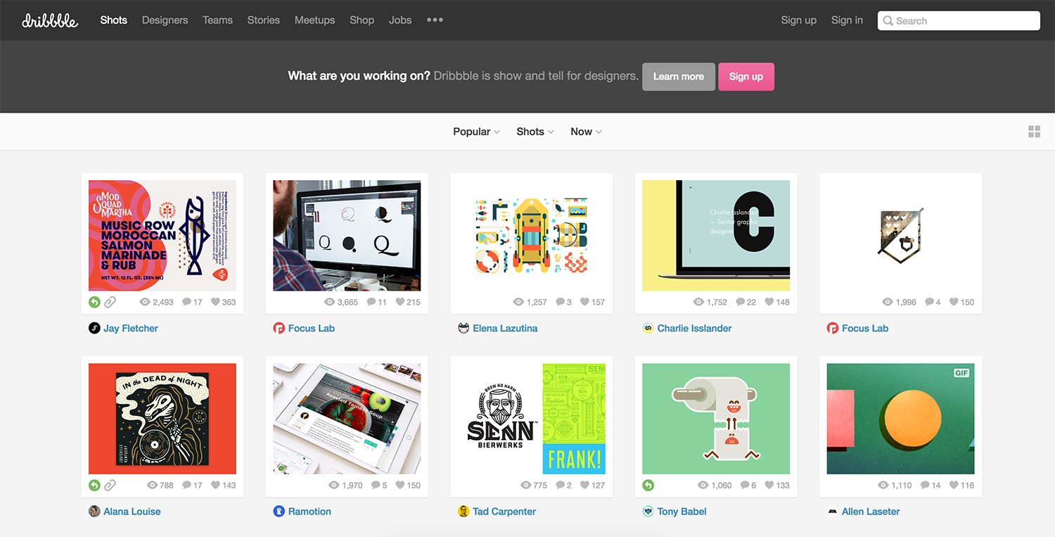
dribbble.com, an invite only sharing platform for designers, is often the go-to place to discover the latest creative trends. It’s also a great example of a functional card UI. With a simple grid, each element is clear, accessible and has equal weighting on the page, allowing user’s to navigate content quickly and easily.
Our prediction – As attention spans become shorter and users seek quicker and easier ways to find the content they want, we anticipate seeing more brands implement this particular UI pattern in order to hold the attention of their visitors, as well as organise ever-increasing amounts of content.
-
Innovative scrolling and parallax
Scrolling, once reserved for getting from top of a page to the bottom, is being used in more creative capacities to deliver content online. Where designers in the past were concerned about keeping the most important content ‘above the fold’, we’re seeing this old-fashioned notion disappear, as ‘the fold’ is now harder to define, as users are viewing content of screens of all different sizes and resolutions.
Scrolling is a versatile mechanic which (when executed well) can work great with all varieties of content delivery. It works with video based content, where large full screen videos play and pause as the user scrolls, as well as static content, which can animate, move, or change depending on the users input.
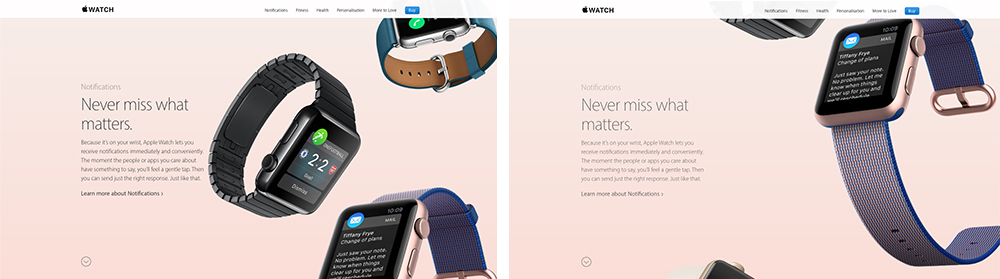
Apple is a high profile brand making great use of scroll within their site (see above). Keeping the all important product descriptions static on the left, a series of watches cascade on scroll creating beautiful, seamless transitions throughout the page.
It’s a mechanic which has many applications, but if abused, or executed badly can be disastrous to usability. However, as with most developments, we expect that as more designers experiment and gain feedback from users, it’ll be something which gets better and better, adding more functionality and additional levels of interaction.
The site for Epicurrence, an annual US snowboarding event (pictured above) makes great use of Parallax, achieving a user experience which is fluid, engaging and that jumps off the page.
We’re also seeing changes in how Parallax is being implemented online, as more brands implement it within their builds to give their sites an extra level of polish. Parallax is essentially a scrolling mechanic which gives a 3d effect as the foreground moves at a faster pace than the background behind it. It’s a great visual tool, which when used well, gives a sense of depth, lifting elements off the screen and creating a sense of dynamism.
For those interested in implementing parallax, we’d recommend checking out Parallax.js, a handy jQuery plug-in for quickly creating impressive parallax effects.
Our prediction: With content creation happening at a far greater pace than ever seen before, and companies finding more innovative solutions for delivering their content to users, we expect the clever use of scroll and parallax effects to be something implemented more and more.
Several high profile companies are starting to implement Parallax within their builds. The usage of some are more subtle than others, but we expect to see the trend develop further in 2016, as brands and designers across the globe tinker with it to suit their own content and purposes.
Conclusion
There are 100’s of ‘trends’ going on in any creativity industry at any one time, and it’s hard to pin-point every single one, but we believe that the above are some of the more core ones to be focusing on in 2016 and beyond.
As with all trends, the above points have come about for good reason; as creatives and clever-thinkers across the globe have all learnt and borrowed from one another to form similar patterns which we see emerge online today. Not all of these trends may be relevant to you and your content, but it’s always beneficial to know what’s happening in the industry and to see where you’re able to improve in order to develop and progress.